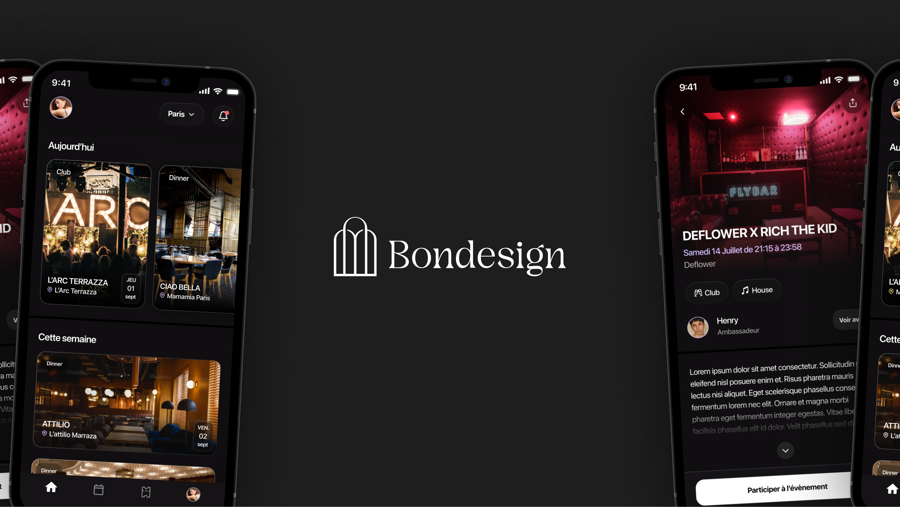
Polished UI and simplified experience for hundreds of attendees.
The user interviews delivered a clear verdict: a rebrand was needed, but it was only the beginning.
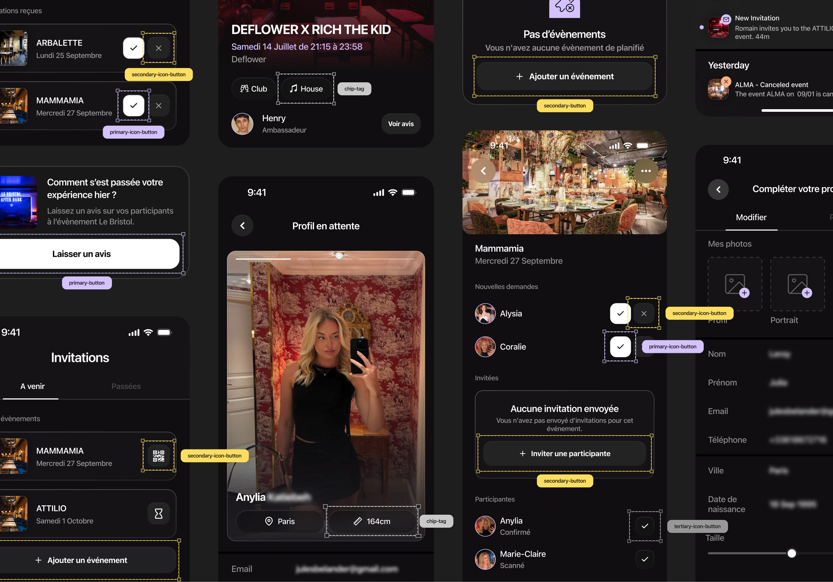
The app itself still carried the roughness of an early MVP — functional, but far from the elegant, professional product the audience expected.
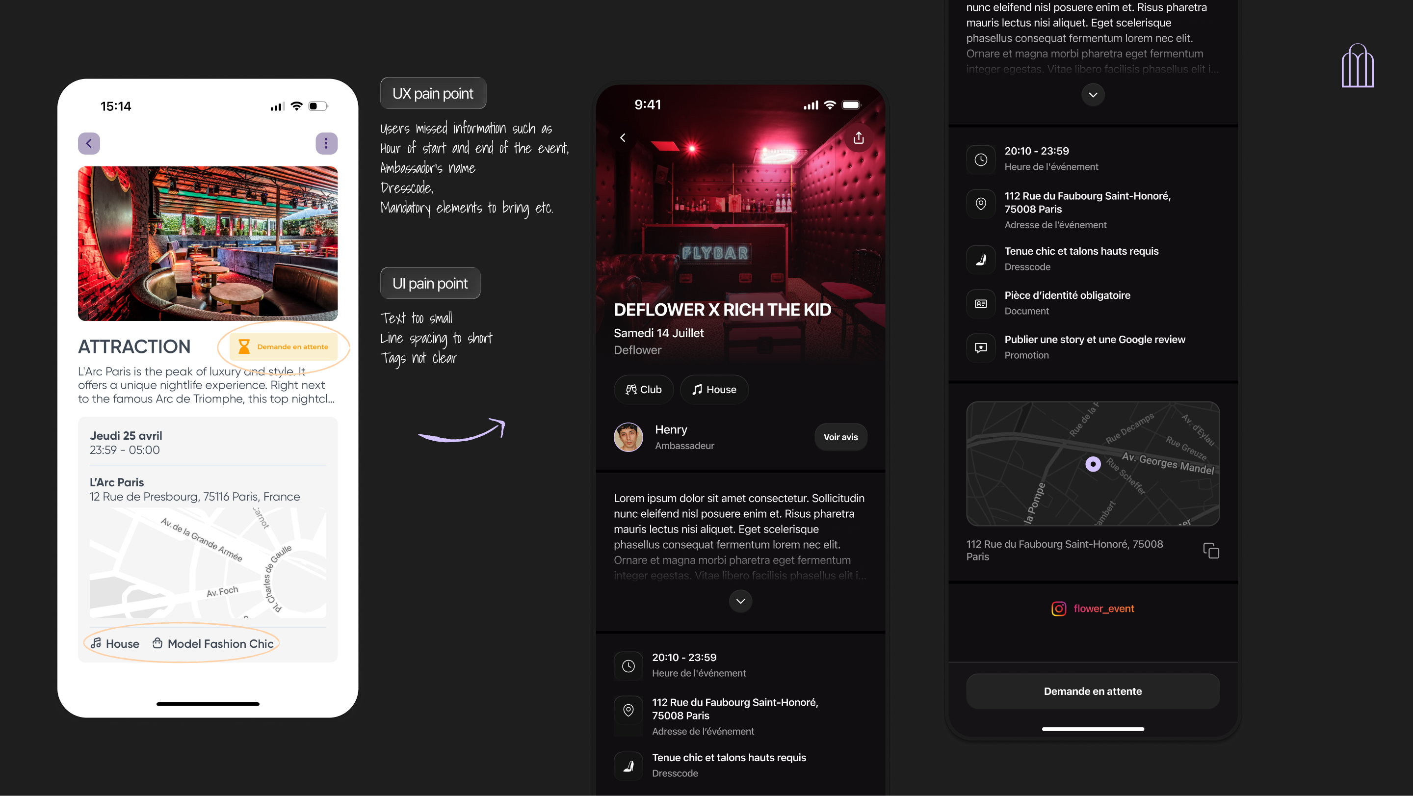
The research also uncovered concrete UX pain points along the way: absent feedback screens left users in the dark, event detail pages failed to surface the right information at the right time, and venue tags created unnecessary confusion. The real work was just getting started.
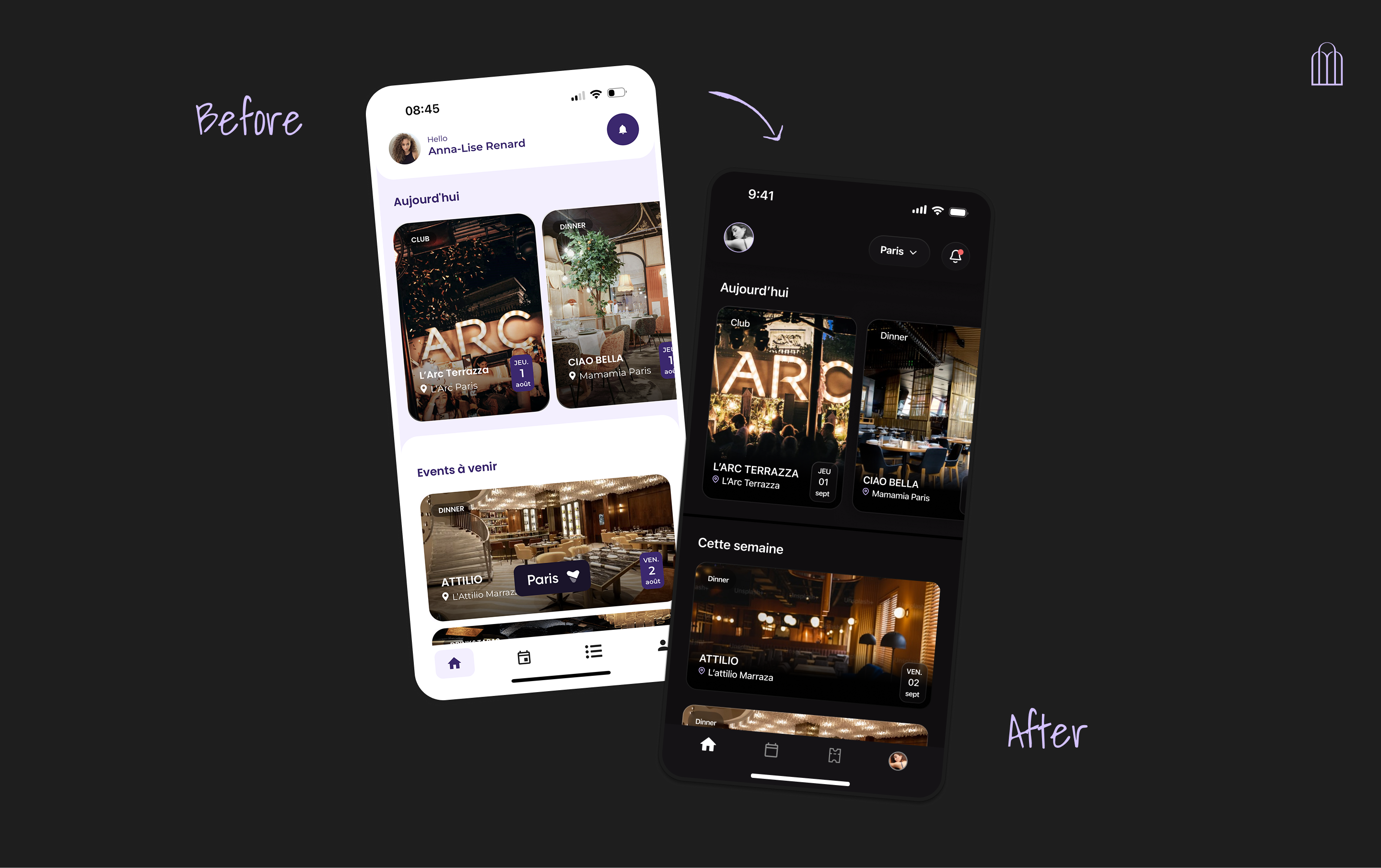
With the rebrand and user research insights in hand, the first sprint had a focused mandate: establish the visual foundation and fix what wasn't working.
I began with a Main UI — a defined design language that would bring consistency and direction to everything that followed. Rather than pushing forward on assumptions, we ran regular user review sessions throughout the process, gathering impressions early and often from a trusted group of users. Once the look and feel was validated by both users and the internal team, I turned to the existing flows — reworking them with fresh eyes and clearer UX intent.
This was the mission for our first sprint. Every step was reviewed and signed off by the Product Manager, founders, and developers, keeping the whole team aligned sprint by sprint.